
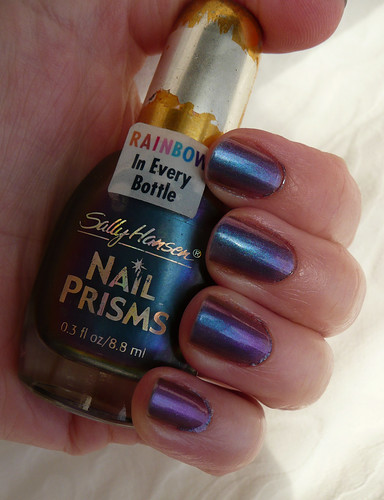
My friend, the lovely squeakymom, found a whole pile of Sally Hansen Nail Prisms in a bargain bin somewhere, and sent me one as a surprise! This is Garnet Lapis.
These are, I believe, discontinued and hard to find. I've certainly never seen them before anywhere. This bottle has clearly been through the wars a bit, but JUST LOOK HOW PRETTY it is!!
This is three coats, with topcoat. The formula is very thin and runny, hence the bits of mess round my cuticles. I bet this would look good layered over a dark colour too, but for today I wanted to try it on its own.

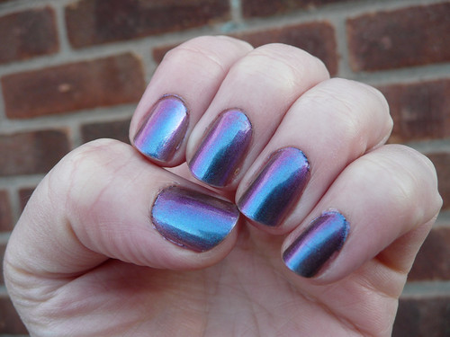
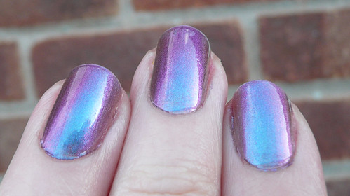
Garnet Lapis is a gorgeous purple to blue duochrome that changes colour quite dramatically depending on the light and the angle. It moves from a bright turquoisey blue...
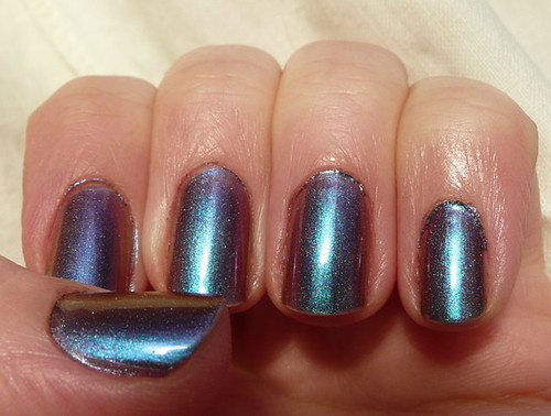
to a deep metallic purple...
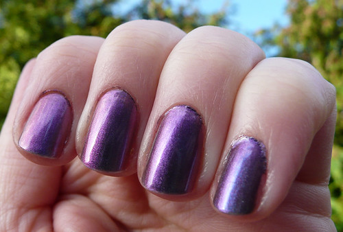
and lovely goldy pink tones at certain angles. I really REALLY like it!
I love this colour! Why on earth would any company discontinue a range like this?
That is gorgeous!
ReplyDeleteIsn't it! I'm thinking it will make another good pendant.
DeleteOh my, it's even better on nails than in the bottle. The blue is fabulous!
ReplyDeleteNail Xchange has a page with pics of most of the set, (except one that I'm sending her) here http://www.nailxchange.com/p/nail-prisms-list.html - I'll tell you the others I managed to get later, if you want to play with any more.
Isn't it lovely? I love it.
DeleteThere are some gorgeous ones. Amber Ruby looks amazing, but they do all look good.
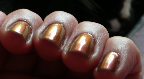
I'm finally trying mine out now (the bottle I kept has the name on it, I could've sworn the 2nd one I sent you was the same, need my eyes testing!) I should be used to how VERY VERY thin these polishes are, but it's hard work. Then I remind myself how it looks and I can manage patience with it because LOVE!
DeleteWhat do you think? It's greener, isn't it? Or is that just mine? My original seems to be blue-purple, but the new one seems to be more green-purple, so I'm guessing Turquoise Opal. I've emailed NailXChange but I don't know if she maybe didn't get the email.
DeleteI've swatched comparisons - I'll post in the morning.
I think it's just yours, there's a definite difference. It was sheer luck of the draw which one I put in the envelope, and it was all under electric light, so they looked the same. No greenish tinge to mine, and it matches the pendant perfectly.
DeleteHow odd! Also I feel guilty now!
DeleteDon't. You'd've had 2 the same & had to swap one otherwise!
DeleteI agree-- these should not have been discontinued. They're so lovely!
ReplyDeleteAren't they? Companies are SILLY!
DeleteThough not an exact dupe, this is quite like W7 in Metallic Venus!
ReplyDeleteOh! I've got that. I've not managed to put it on properly as it smells so awful, but I'll have to check it out.
Delete