A friend recently gave me a surprise present - look how cute this set is!
I've heard of the brand but only very vaguely, and never seen it in shops at all. My first try is the silver one.
This is two coats of the silver. I don't think it has a name, although perhaps the number is the identifier.
The formula of this was really nice. This is two coats, but it was almost a one coater. The polish is smooth, easy to apply neatly and dries quickly. I'm not crazy about the brush, as the square lid is quite awkward to hold, but it's not so difficult that it spoils the application.
Of the silver polishes I've tried, this is one of the better ones by a long way. It's not brush strokey, and it didn't chip or peel in the three days I wore this. The shine is really nice, and seems to have a real glow to it.
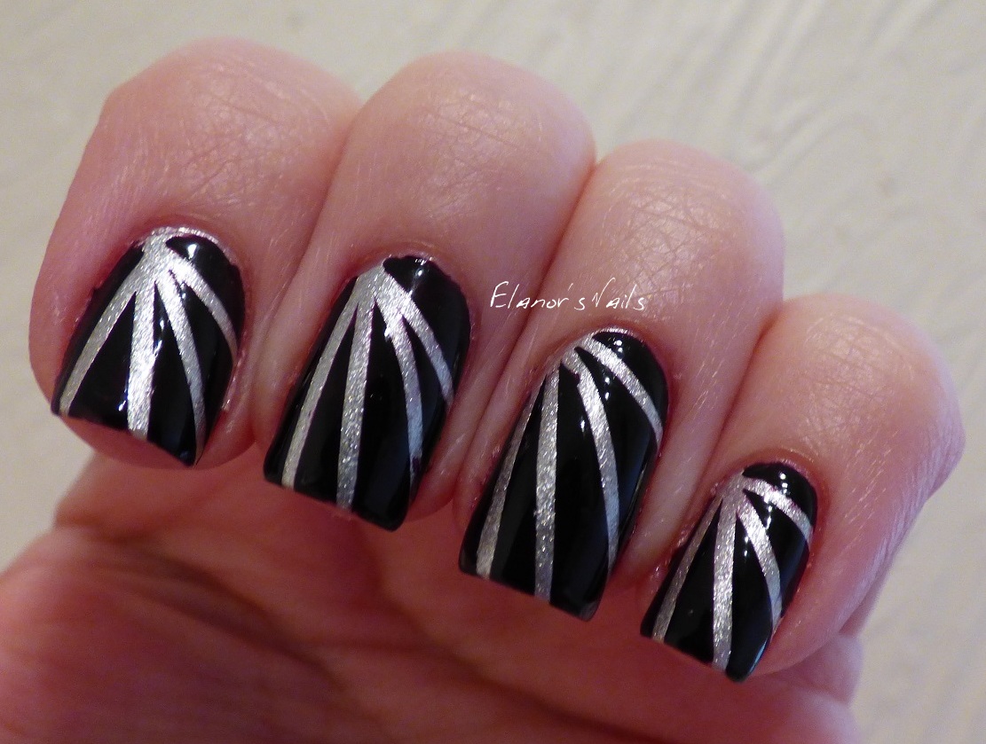
After two days I used striping tape and Barry M Black Currant to make a rays design.
I like this look too, although Black Currant still just looks black to me - it's very hard to see any purple there!
These are the nails I've worn for the last couple of days - more thermal polish with stamping, which is one of my favourite things to do.
This is Dance Legend Thermo Trio, which shifts from a pretty pale lilac when warm, through pink to dark purple when hot. I then stamped over this with Barry M Silver Foil and Born Pretty Store stamping plate BP-48.
I love how this came out, although it was really hard to capture the cold colour, as it's been so warm recently. I'm always really hot at the moment!
The Born Pretty 48 plate is fast becoming one of my favourites. The pattern is so pretty. I especially like the swirly bit on my ring finger.
Just a quick post today to show you what I was wearing at the weekend. This is a base of the OPI Color Paints and stamping with silver over the top.
I started with a base of OPI Silver Canvas, and then used a coat of Pen & Pink. I then stamped over that with silver (I was going to use Silver Canvas, as it does stamp, but I only have a mini and I don't want to waste it! Instead I used Barry M Silver Foil.) The stamping plate was the MoYou London Pro XL 06. I really love this plate, and use it a lot as there are so many good designs on it.
I really like how this came out. It's so shiny and bright and pretty! What do you think? I love it when you comment!
Today I have another Born Pretty Store stamping plate to show you. This is plate BP-58, which is available here for $2.99. As you can see, this plate has lots of cute birds, and some lovely individual feathers.
I did two looks with this plate, one with a full nail design and one with an individual feather.
This first design has a grey base of Nella Milano Mercury Haze. I then stamped using the birds on a wire part of the plate and Barry M Silver Foil.
The plate stamped really well, apart from that one spot on the tip of my index finger - that was my fault though, not the plate's.
The second look I did was with the peacock feather in the centre of the plate. I started with a base of Chanel Peridot, which is a polish I just love for its gorgeous greeny gold finish. I had initially planned to stamp using a bright turquoise metallic blue, but apparently none of my polishes were suitable as they just didn't show over the gold. Nothing to do with the plate, it was just the polish wasn't pigmented enough.
Instead, I used China Glaze Don't Make Me Wine, which is a gorgeous dark metallic reddy purple. This stamped beautifully, and I love how this looks! Don't look at my poor stumpy thumbnail! It broke badly across the corner a week ago, and is still not really presentable.
This looks fab in the evening sunshine!
I think this is a really nice stamp, and I can definitely see this one getting a lot of use. I think the cute cartoon birds in the heart would make a lovely spring or Valentine's mani.
The plate is currently $2.99, but you can get 10% off using my discount code.
I received this product for review purposes, but words and opinions are entirely my own. I do not receive anything if you use my discount code, although when it's been used ten times, BPS will let me host a giveaway for my readers! See my Disclosure page for more details.
Ever since I first saw the press release for these, aaaaages ago, I have wanted the OPI Color Paints polishes! They're described as "blendable nail lacquer" colours that can be combined for all sorts of artistic effects. Officially, these aren't on sale in the UK until July 1st, and will only be available in Selfridges. However, they are available on Amazon from lots of different sellers. I bought a set of the minis, as I couldn't decide on what colours I wanted, and didn't want to spend a fortune buying several and then be disappointed.
This set has Silver Canvas, the 'undercoat' polish, and then 5 of the 8 colours: Primarily Yellow, Chromatic Orange, Pen & Pink, Purple Perspective, and Turquoise Aesthetic.
How sheer are they?
They're sheer, but very pigmented, so they're nowhere near as sheer as polishes like the Sheer Tints. Depending on the colour, some are more sheer than others. They are beautiful, glossy and pigmented jellies.
Here are, left to right, Primarily Yellow, Chromatic Orange, Pen & Pink, and Purple Perspective with one coat each.
Here they are with two coats each.The yellow is obviously more sheer than the others. The purple in particular is almost opaque. But I love how juicy and glossy they all are!
Do I need the silver base?
Well, it's going to be up to you. You probably don't need this specific silver base. Do you need a silver base? No, but it does do something different to the polishes.
Here is Turquoise Aesthetic left to right over the silver base, no base, and a white base. As you can see, the polish is less streaky over the silver base, and the colour pops much more. On its own, you have the sheer effect and less colour-pop, and over white you get the colour-pop but have some streakiness. Which you prefer is going to be a matter of personal taste.
How does the silver compare to other silvers?
Left to right, I used Models Own Chrome Silver, Barry M Silver Foil, OPI Silver Canvas, and OPI Push and Shove. These are all one coat, except the Models Own, which is two.
The Models Own Chrome Silver is good for stamping, but I find it hard to use as a polish on its own as it is quite thin, and drags a bit on application, so ends up streaky unless you're really careful. As you can see, it's a bit uneven in application. The Barry M Silver Foil is excellent for stamping, but nothing special to wear on its own. Silver Canvas is nice and even. OPI Push and Shove is really nice as a shiny chrome, and is definitely shinier than the others here. I found the two OPIs very similar in application, although Push and Shove is more of a mirror-shine. Silver Canvas is really nice to apply, and isn't nearly as brush-strokey as many metallic polishes are. If you already have a silver chrome/metallic that you like, then you probably don't need Silver Canvas too.
I tried the Color Paints over all the silvers. As you can see, they're much of a muchness, so if you already have a silver you like, I wouldn't buy another just to use with the Color Paints.
How do they compare to the OPI Sheer Tints?
Very well! I was really excited when the OPI Sheer Tints came out, but they were so disappointing. Formula was gloopy and thick, and the colour was far more sheer than I'd hoped for. The Color Paints are what I hoped the Sheer Tints would be.

Here I've compared Purple Perspective and Don't Violet Me Down from the Sheer Tints range. Left to right is one coat of Don't Violet Me Down over silver and on its own, then Purple Perspective over silver and on its own. This is typical of the difference - the Sheer Tints are very pale, just a hint of colour, where the Color Paints are very pigmented. The formula of the Sheer Tints is also really difficult to work with as it's so thick and sticky. The Color Paints have a much better formula - it's much less thick, and not at all gloopy. It seems strange to me that the formula can be so much thicker on the Sheer Tints, and yet the colour less visible, but I suppose that was what they were going for. Anyway, Color Paints beat Sheer Tints hands down for me.
Do they water marble?
Yes. I struggled to get the mini bottles to drip well, which meant that the colours dried more quickly than I could work with, but the actual spread is really good, and they look really zingy.
Left is over silver, right is over white. I think my issue was only because the mini bottles are so small that you need to be careful with the brush, so the dripping takes longer and leaves time for the polish to dry on the surface of the water. With full size bottles, I think this would be fine.
Do they stain?
Generally, no. But you probably need to be very careful with Turquoise Aesthetic!
Can you stamp with them?
No. But you can stamp with black over a base, and then use them for leadlighting. This is my next mani plan for these - I'll add a link here when I've tried this!
What can you do with them?
Lots of things! Here are two designs I did.
This ruffian design uses the Silver Canvas base. I then painted on Chromatic Orange and Purple Perspective on alternate nails. I also added a stripe of another colour over the original - Primarily Yellow over the orange (which doesn't show) and Pen & Pink over the purple (which does!).
I wore these for a day, and loved how glowy they were.
My second design was this freehand flower art, which I did using all the colours and a fine paintbrush. I don't have the green one, so I used yellow and turquoise together.
I love how this looks!
It really glows in the evening sunshine!
What's the formula like?
It's good. Even and smooth, and not too thick and gloopy like the Sheer Tints, but not so runny that it floods the cuticles. Application is nice and easy, and drying time is normal.
Overall, I LOVE this collection. I am definitely going to buy the red one in a full size, although I'm not sure I need the darker blue or the green. I may well also buy some of these mini colours in the full size, although I need to wait til after pay day!
I've got another Born Pretty Store stamping plate to show you today, with two separate looks.
This is plate BP-50, which you can see for sale here.
The first look I did was a bit of a failure. Nothing to do with the plate, it was just colour choices. I did a blue and white water marble, using Barry M Cotton and Cyan. Then I stamped using Barry M Silver Foil. The plate itself is really good - the design transferred really clearly. However, the silver was just too pale to really show clearly, I think. It's pretty, but I wish I'd stamped using dark blue or something.
The second look I did was a gradient of Barry M Cotton and Key Lime, and then stamped using the leaf design and MoYou London Spring Green. I love how this came out!
The leaf design is really pretty, and I think it's my favourite on the plate.
The plate is currently $2.99, but you can get 10% off using my discount code.
I received this product for review purposes, but words and opinions are entirely my own. I do not receive anything if you use my discount code, although when it's been used ten times, BPS will let me host a giveaway for my readers! See my Disclosure page for more details.
Just a quick post tonight - I've been pretty lacking in nail mojo so far this year!
This is a base of a pretty grey creme from a new brand, Nella Milano. This is two coats of Mercury Haze. I'll have a full review of this and another colour coming up in the next few days.
I stamped over this using Barry M Silver Foil and the MoYou London Pro XL 06 plate, using the pretty filigree design.
I really loved how this came out, and have worn this for three days.
I live in Chesterfield, in lovely Derbyshire, and I love it here. This week I was feeling very uninspired for nail designs, but then on Monday I saw a competition to make "something" inspired by Chesterfield, which gave me some ideas! It may well not be what they're wanting, and it's not about winning, but at least I got some inspiration!
If you don't know Chesterfield (and you probably don't!) then it's a smallish town near the Peak District, and the most famous thing is the Crooked Spire, which you can see from the train if you're going THROUGH Chesterfield, which if you've ever travelled north-south in England, then you've probably done. But there's more to Chesterfield than the Crooked Spire!
So here are my inspirations:
The Crooked Spire:
Linked to this, the logo of my workplace (although we often use this in lime green):
Photo credit: Chesterfield College, chesterfield.ac.uk
The historic market:
Photo credit: chesterfield.gov.uk
The half-timbered buildings of Knifesmithgate:
Photo credit: geograph.org.uk
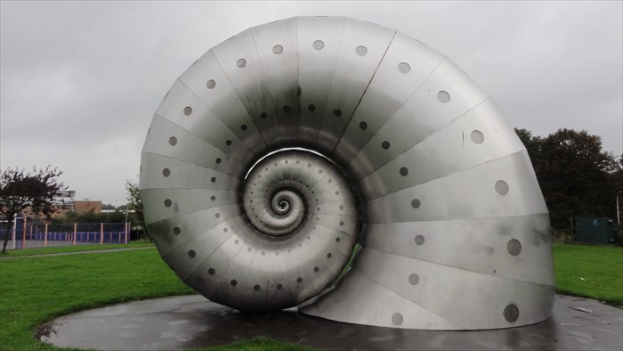
The super cool snail sculpture. This is a sculpture by an artist called Liz Lemon, and can be found near the train station.
 Photo credit: Waymarking.com
And of course, the football team!
Photo credit: chesterfield-fc.co.uk
And here are my nails!
I used a base of Barry M Pearl on my little, ring and middle fingers, a base of Barry M Mist on my thumb, and Barry M Blue Grape on my index finger.
I then painted the snail freehand using a fine brush and OPI Push and Shove. I accented this with Barry M nail art pens in black and white. I also used the Barry M pens to do the CFC logo on my index finger. I didn't add the red that's in the proper logo, as I don't have a fine enough brush to do this or a red nail art pen.
I used She Sells Seashells straight stencils to make the chevrons for the market stalls, using Barry M Spring Green. I painted the spire and the frame round it using Barry M Key Lime and a fine brush. The little finger is a bit messy! I used Barry M Cocoa, and a fine (not fine enough!) brush. I wasn't thrilled with how that one in particular turned out, but I suppose the half timbered buildings are a bit rustic too...
These weren't hugely successful! Most of my colleagues didn't know what most of this was meant to represent - EVEN THE ONE THAT IS OUR WORK LOGO! Oh well, at least I had fun!
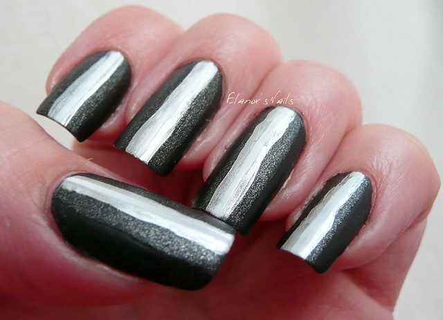
It's Polish Party time again, and this month's theme is 'Inspired by Another Member'. There are many very talented ladies in this group, and lots of designs I could have chosen, but one design I keep coming back to again and again is the gorgeous ombre stripe design by Madison at Fundamentally Flawless. She has done this design in pink, blue and green, all of which I love, and she has posted a tutorial, which makes it look super easy!
 It isn't easy at all!
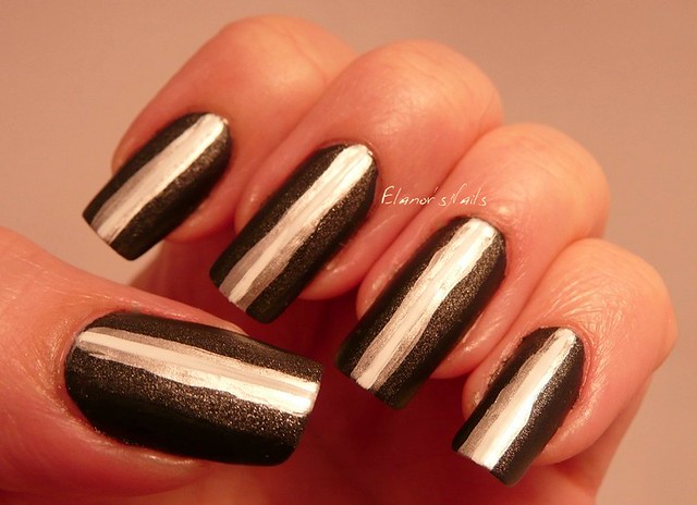
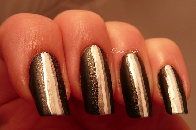
I love the bright colours that Madison used, but I wanted to see what it would look like in monochrome colours. I started with a base of OPI 4 in the Morning, a matte black. Next I used China Glaze Stone Cold, a gritty dark silvery grey. Then I used OPI Push and Shove, the bright silver chrome, using a narrow nail art brush. Finally I added a stripe of Konad White using a thin striper brush.
I'm not at all pleased with these: the contrast between the colours is all wrong, so instead of being ombre, it's more of a dark bit, and then a light bit. As you can see, the white line isn't really visible on top of the silver. My lines are too wobbly too for my liking - I found it really hard to keep a steady hand - I just can't paint in a straight line!
Oh well - maybe I'll get it better next time!
Have a look at the rest of the group's posts on the links below - as you can see, it wasn't just me who had a go at Madison's design!